This blog is a bit personal, because color is personal and purple/violet is one of my favorite colors. I personally like cool colors more than warm ones. I get tired of warm colors very easily; I don’t know why. I’ve painted walls in warm colors before, and then repainted them in a week. Violet has just enough warmth.
Violet and yellow are colors that are very complimentary to each other. (I like yellow in general.) Some colors are good friends, and some colors do not like each other! When you know they are best friends—complimentary colors—why not use them together?
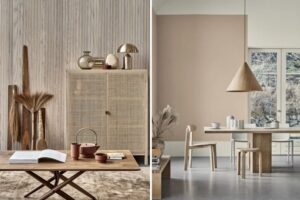
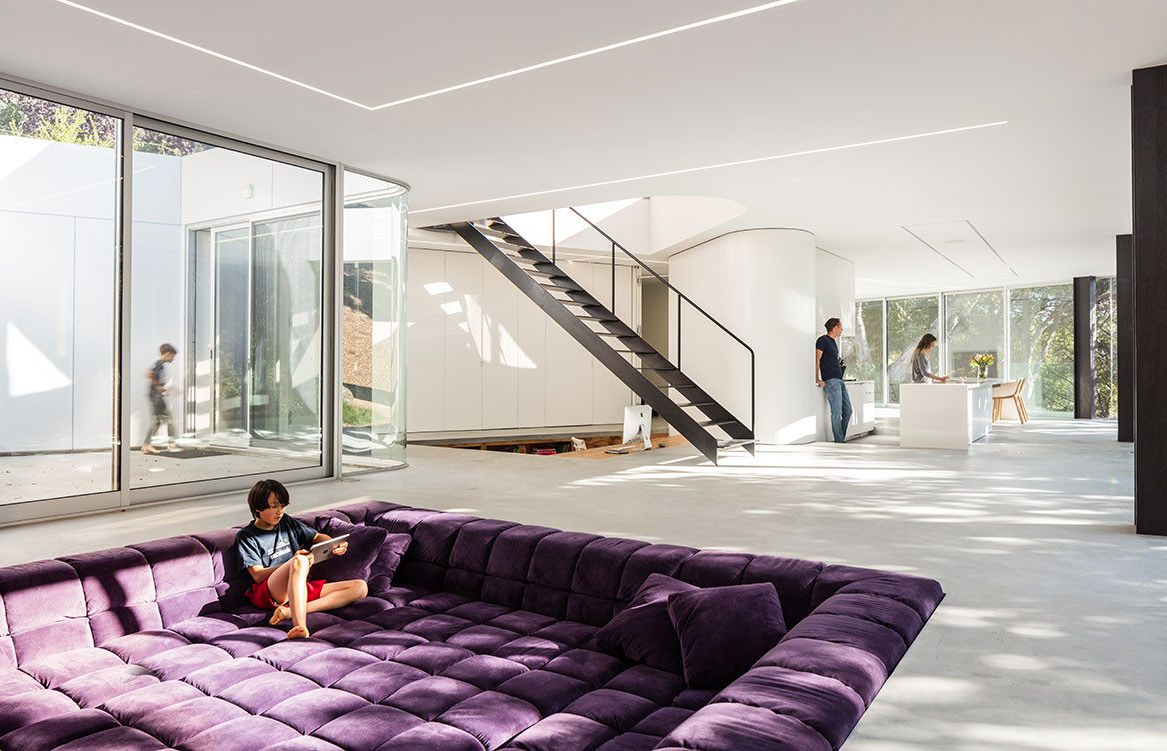
When it comes to interior design, purple is not an easy color to work with. If you think of your wardrobe, do you even own purple clothing? Blue is always classic (jeans, shirt, etc. You probably own lots of blue clothes.) In a room, purple could be the best or the worst color. I tend to like really deep, saturated violet. Lilac or light purple tend to be read wrong unless the color is intentionally and widely used. This also works with my personality: I like to have strength and intensity in color when I use violet as an accent color. Note that it could become too overwhelming in a room when violet is used too much. Paint only selected walls, or use a couple furnishings or accessories, using violet as an accent color, rather than painting all the walls violet.
Here are some tricks to using violet in a room: 1. Use blue violet and red violet next to violet. It’s called an analogous color scheme. This enhances the violet. 2. If the color scheme in your room is subtle, use it subtly. Some grays are warm grays with violet, for example. It is harmonious when the same tone is used in a room. 3. Violet is not a good color when your room is too small. If your room is too small, use it in your furniture in a small portion, or maybe use a lighter color. Lilac is a better option. Moroccan and Indian culture-themed spaces often use a family of violet colors: way too much, in my opinion. Too much of a good thing is never good, and less is more. Use violet strategically and intentionally in your interior designs!
*Featured image credit: Dwell