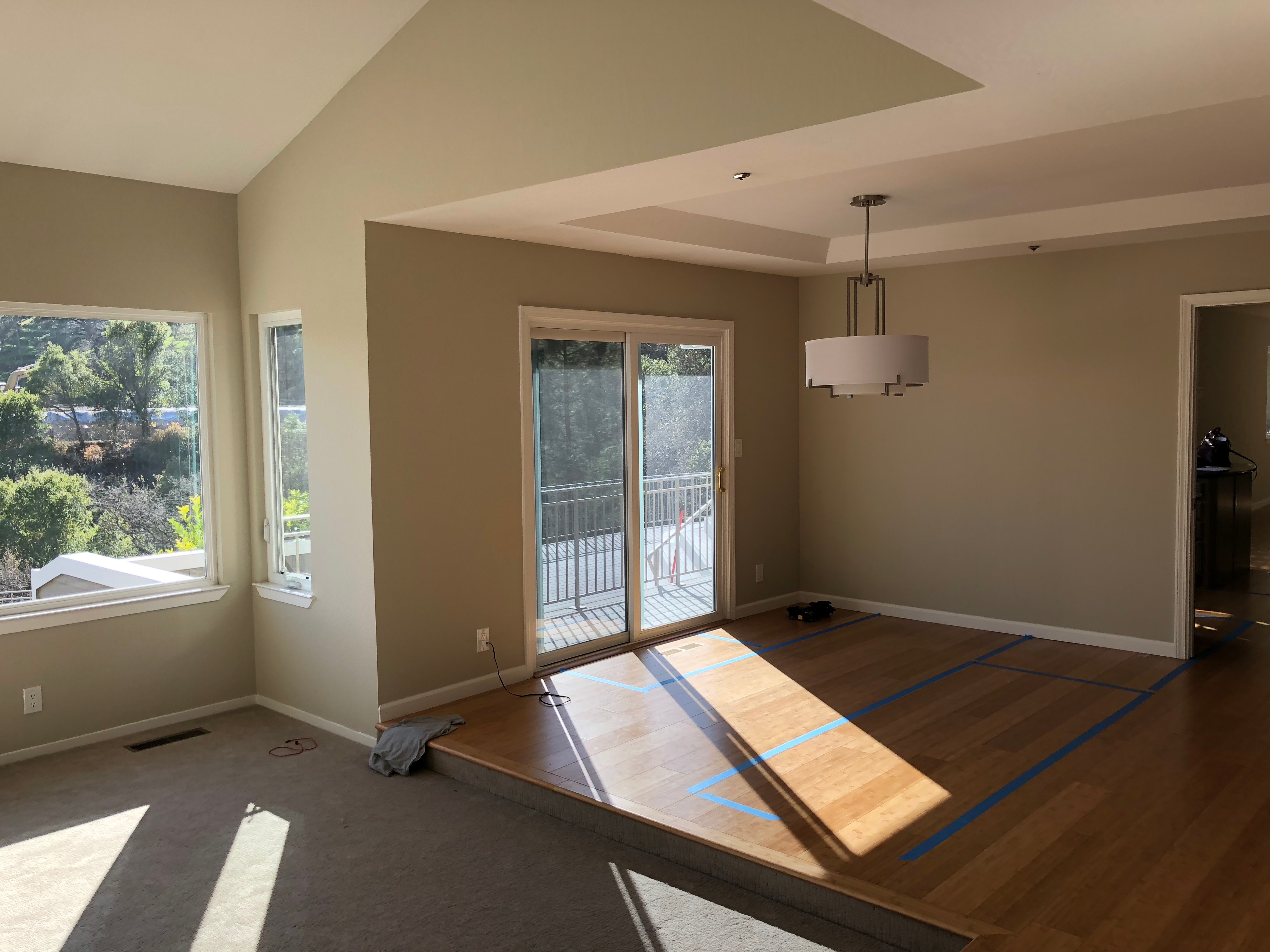
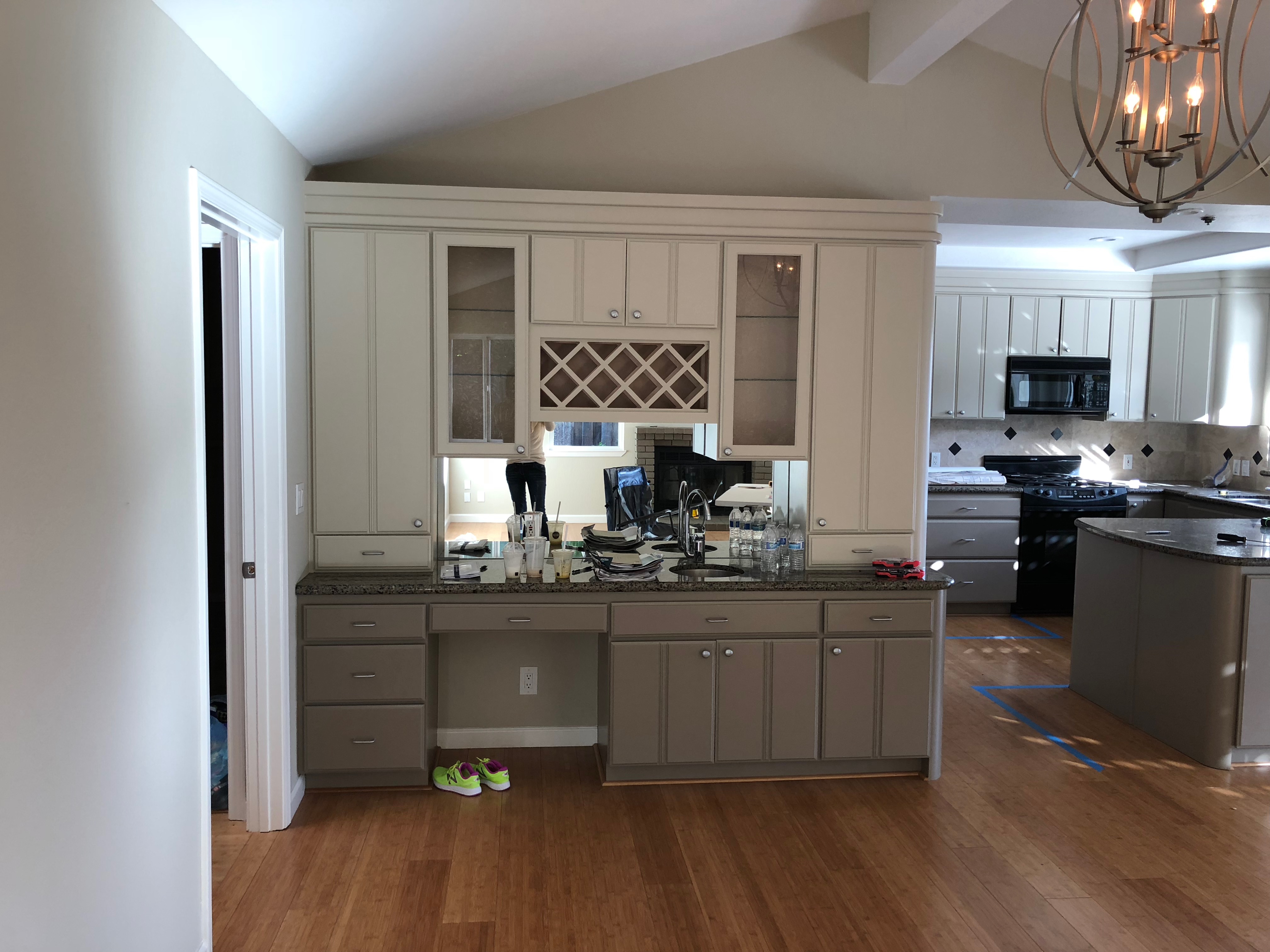
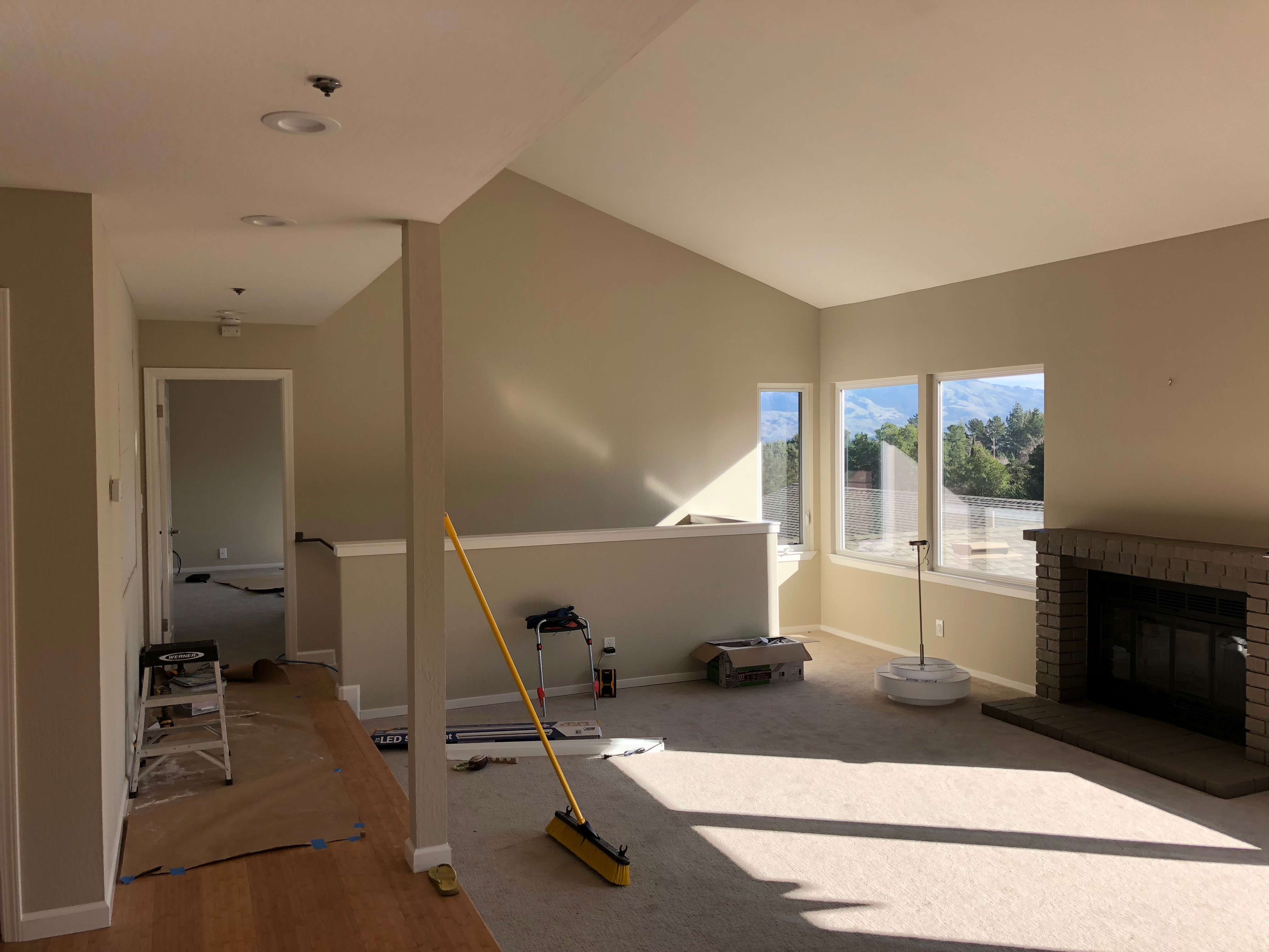
Before: Unnecessary Architectural Separation
This home’s kitchen and living area needed some serious work! For one thing, the wall separating the dining space from the kitchen made this house feel too chopped-up. For another thing, the bamboo flooring in the dining and kitchen areas, along with the beige carpet, made the whole space look dated and damp. The sunken family room adjacent to the dining was a big problem for an open concept; it made the dining area and kitchen too small for a 4,000 square foot home. Even the ceiling in the dining area and kitchen had a weird 2-level ceiling. The dingy fireplace in the family room was a terrible eyesore, painfully detracting from the nice view. Every single surface had a negative value. I had to remove those and start over. This was the first room you saw when entering the house, so my objective was to open up and unify all the spaces, creating a sleek modern statement kitchen for a family hub. This was a tall order!
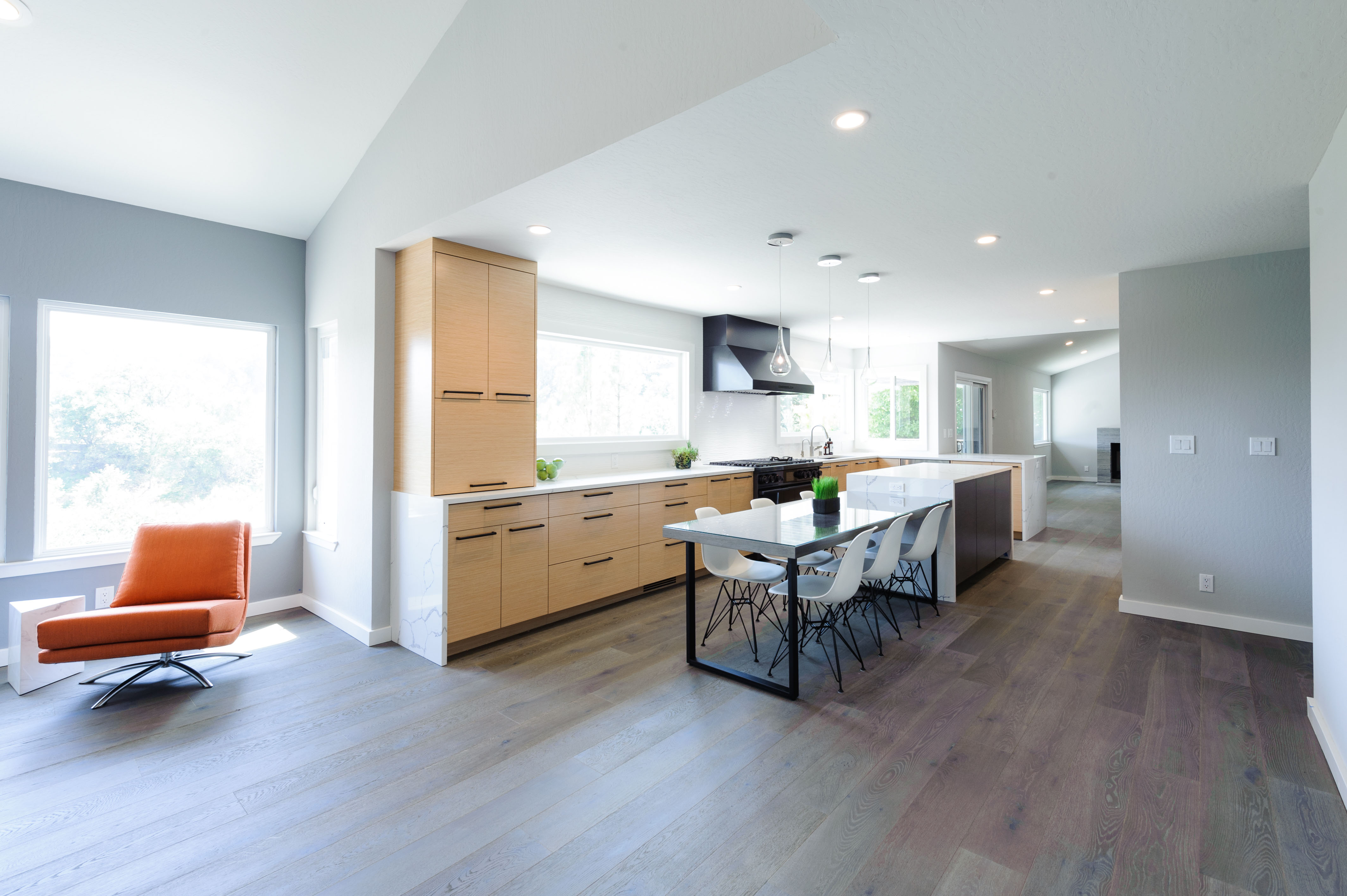
After: A Bright, Open, Airy and Unique Kitchen
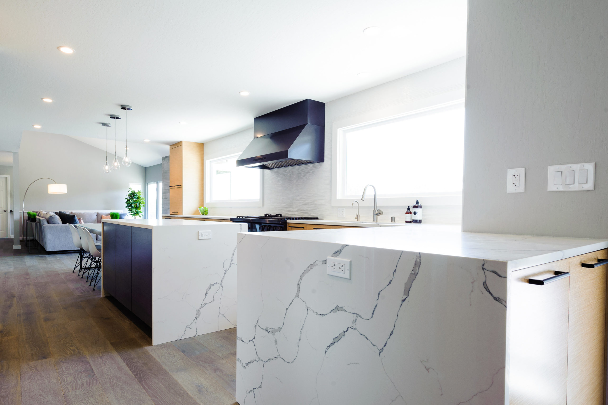
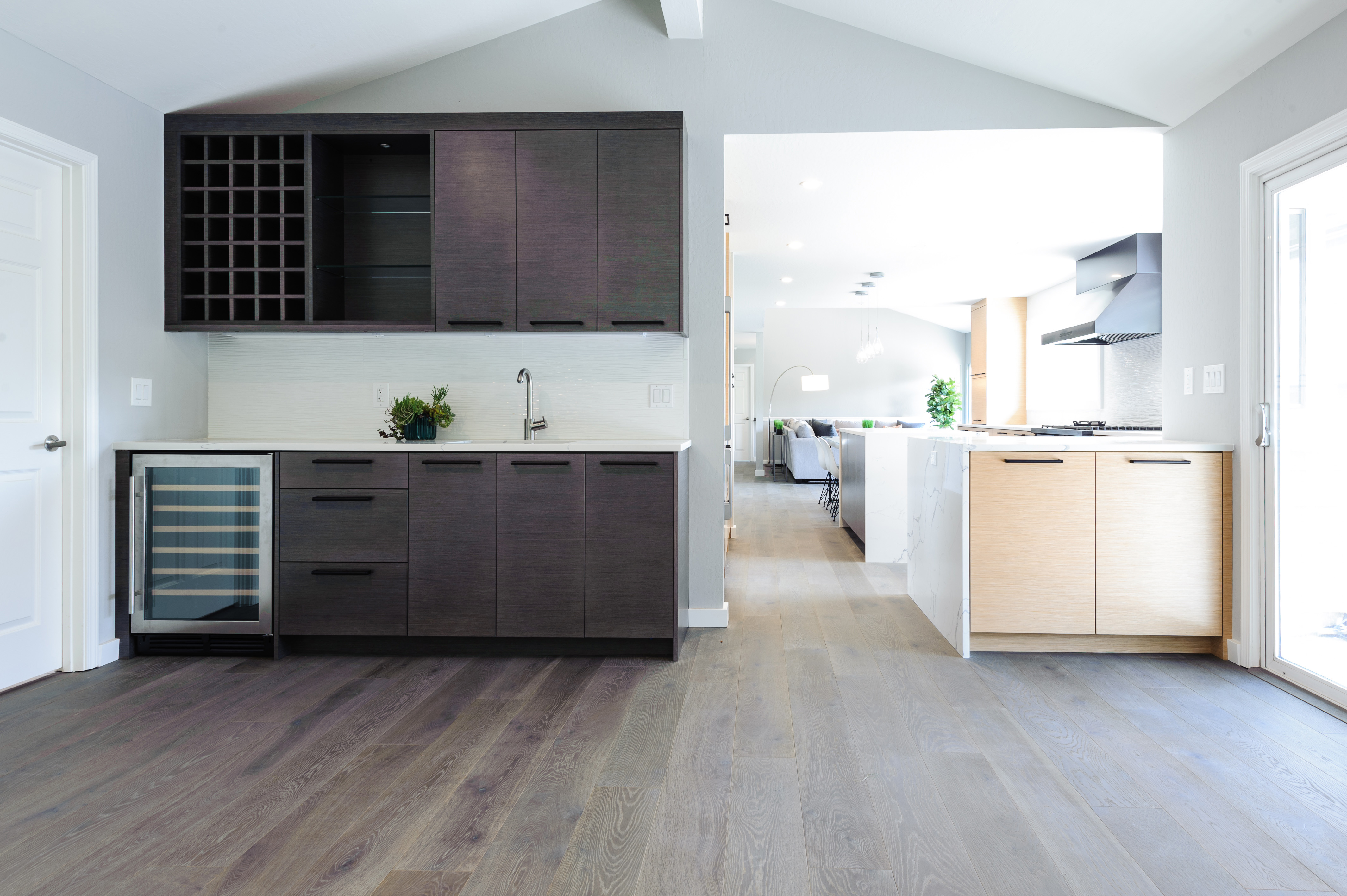
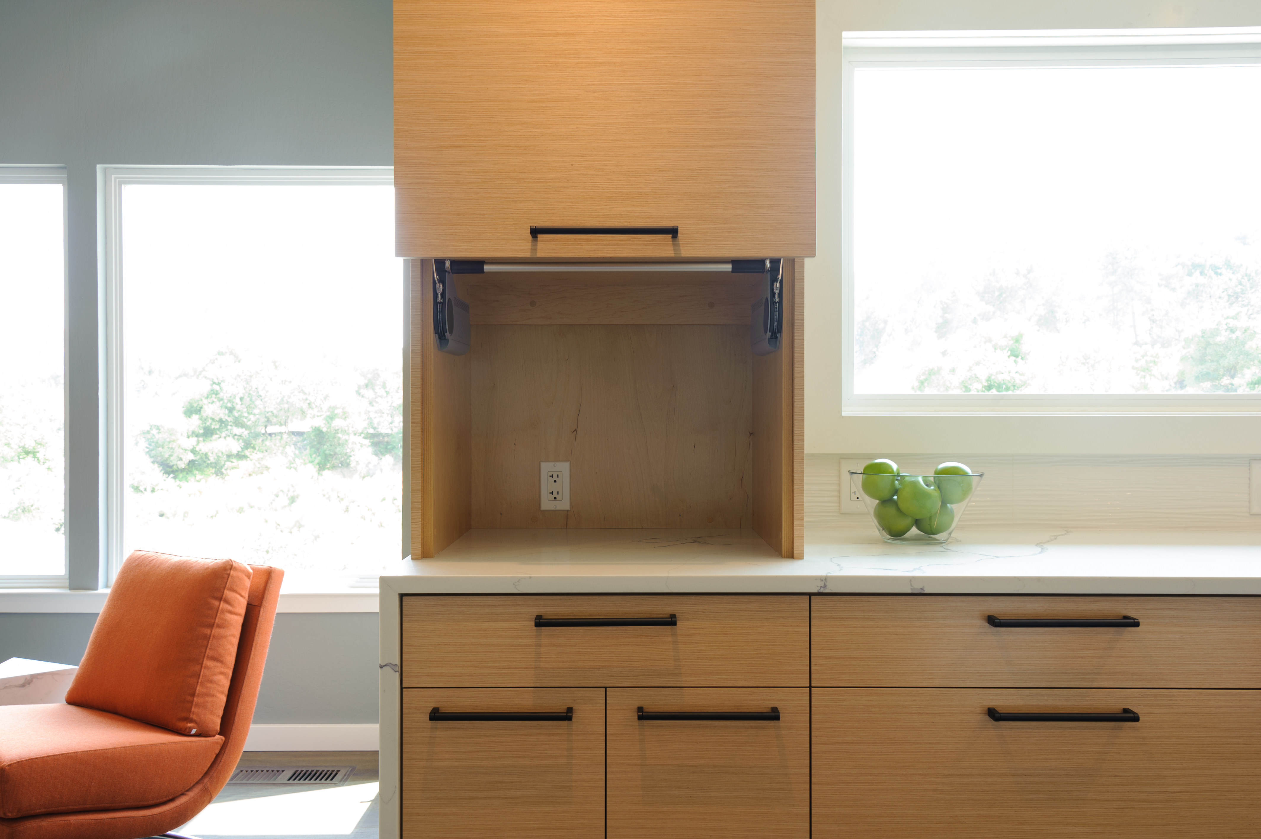
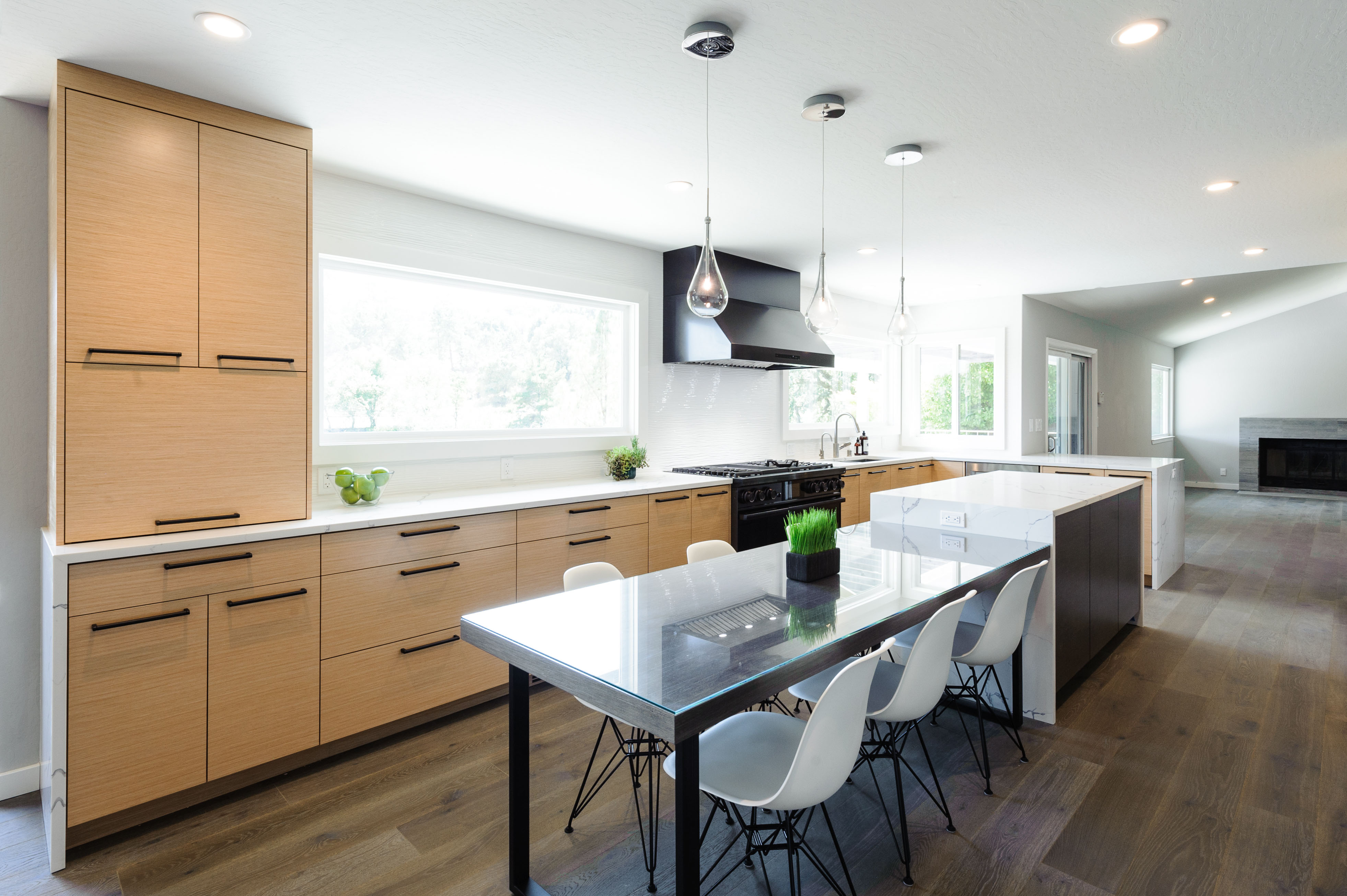
This renovated kitchen now feels large, airy and filled with light!! The transformation involved paying attention to the building blocks: Great space planning, a beautiful color scheme of blue-grays with a pop of complimentary orange, the contrasting two-tone cabinets, and smart cabinet storage. The new, consistent, large picture windows now “frame” the view of the new kitchen. The new lighting is sleek-modern, as is the spacious counter for cooking and eating. The result is a very calm, clean, asymmetrical design with a lot of sensible, tailored and layered details.
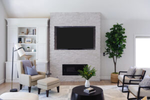
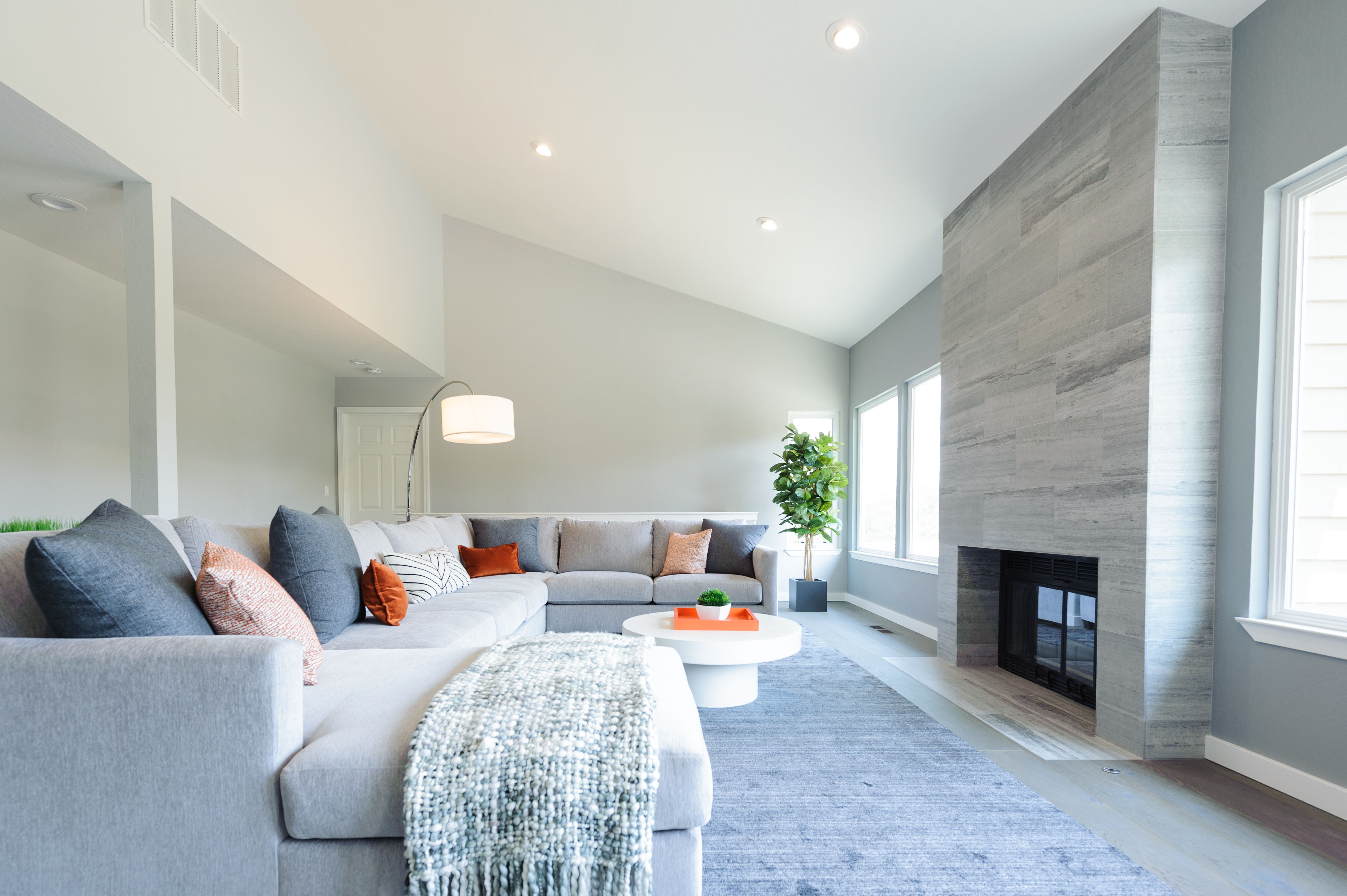
If you’re looking for kitchen remodeling inspiration that includes a wall removal, consider this layout and design as a new template and principle. It’s a road to success! I opted for a backsplash of textured, large scaled 18”x36” unexpected white tiles and tore down the wall separating the kitchen from the living space to make it feel more open and spacious. No more mismatched flooring, and all the flooring is at the same level. In the beginning, these clients couldn’t see my vision of raising the existing sunken family room floor up to the rest of the house because we would lose 6”. After presenting the design visually to them, however, it became clear it was the right thing to do. The kitchen island also introduces extra seating and a dining space to replace their original formal dining area. The island is a statement with waterfall counters. I mix-matched appliance finishes to highlight the hood and stove in matte black stainless, and kept all the other appliances in stainless steel. (Yes, two microwaves–super optimized in a large kitchen!!) The dingy original fireplace in the family room became an ultimate focal point with floor-to-ceiling sexy Italian marble. Your eye moves from the fireplace and onto the new modern open kitchen to a beautiful view of the valley. I am grateful and lucky to be a part of realizing their dream come true.

*Featured image by Yoko Oda Interior Design, LLC
Happy renovating!
Yoko Oda is a San Francisco Bay Area-based interior designer, of Yoko Oda Design LLC. Yoko loves to renovate fixer-uppers for her clients in her unique Japanese inspired modern style, and to make her clients’ dream come true.
