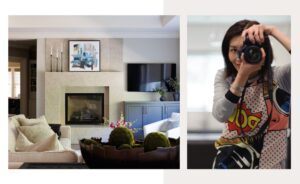
LIVING AND DINING ROOM PROJECT
While challenges can appear daunting at first, they are what make many remodel projects exciting to me– especially when the finished product is a beautiful, harmonious room!
This Walnut Creek residence had its living space and dining room combined in only 415 sq. ft. The glass on the front door was worn out with old paint, and the old window treatments contributed to the dowdy appearance and the poor lighting. Two pillars had been stuck near the front door to give an ‘entry’ sort of feel, but simply looked strange. Finally, there was very little storage space in the room.
OWNER REQUIREMENTS
The owners had some very specific requirements. They wanted a foyer with an organized hutch for lots of shoes, hats, and knick-knacks (sunscreens, wallets, etc.) and an umbrella stand. The dining area should be distinctly separated and more efficient to store dishes and cutlery. They also wanted a little office space with a desk and cabinetry for filing. Talk about a space planning challenge!
One of the reasons they selected me as their designer was they liked my eco-minded, harmonious Asian designs. At the same time, they wanted the space to be modern and comfortable, with much better lighting. Of course, all within their budget. The look would be the easy part.
SPACE PLANNING
This involved a combination of designing individual sections so they could be functional and attractive, while modifying the floor plan to make sure the entire room flowed in a balanced and pleasant manner. Both to accommodate the space and the modernization, I designed a couple of pieces of furniture that worked better than stock pieces.
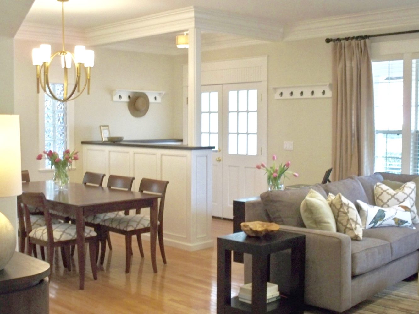
The first step was to remove one of the non-functional pillars and build a low wall across that visual line. On the dining side, cabinetry added some storage space for plates, etc. I cut the other pillar so that the top part sat on the end of the new cabinet, which added a feel of separation while not erecting a visual barrier.
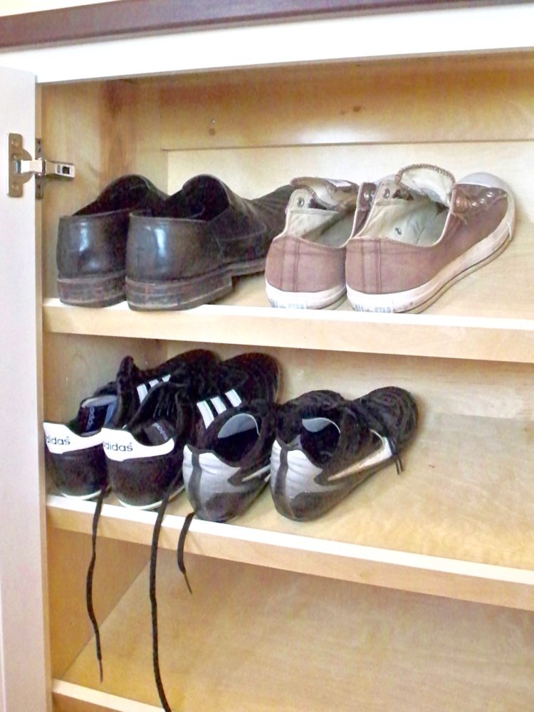
More custom designed cabinetry created a tiny ‘foyer’ to the side of the new entrance. The foyer cabinets are like a Japanese shoe cupboard with some of the shelves inside tilted so that even large shoes will fit in the 12 deep cabinets! Naturally, little niches and drawers accommodated all of the ‘knick-knacks’, and the corner nearest the door contained an umbrella stand.
To separate the living area from dining, I added a bar and a sectional. The custom-designed sectional was a hybrid of chaise and regular sectional to fit exactly into the shape and size required, but my sources built it at a comparable price to a stock model. Then I added a sideboard/credenza backing onto the sectional so there is more storage and a surface to place side dishes.
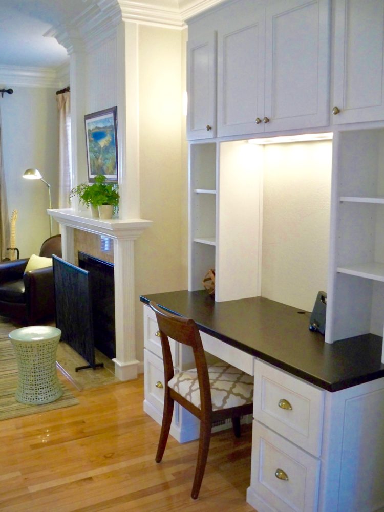
Finally, the corner of the living space became an “office”, a desk with filing cabinets and some storage cabinets above.
THE DESIRED LOOK AND FEEL
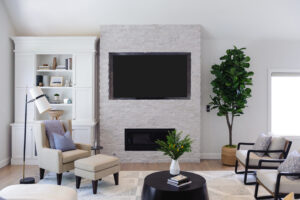
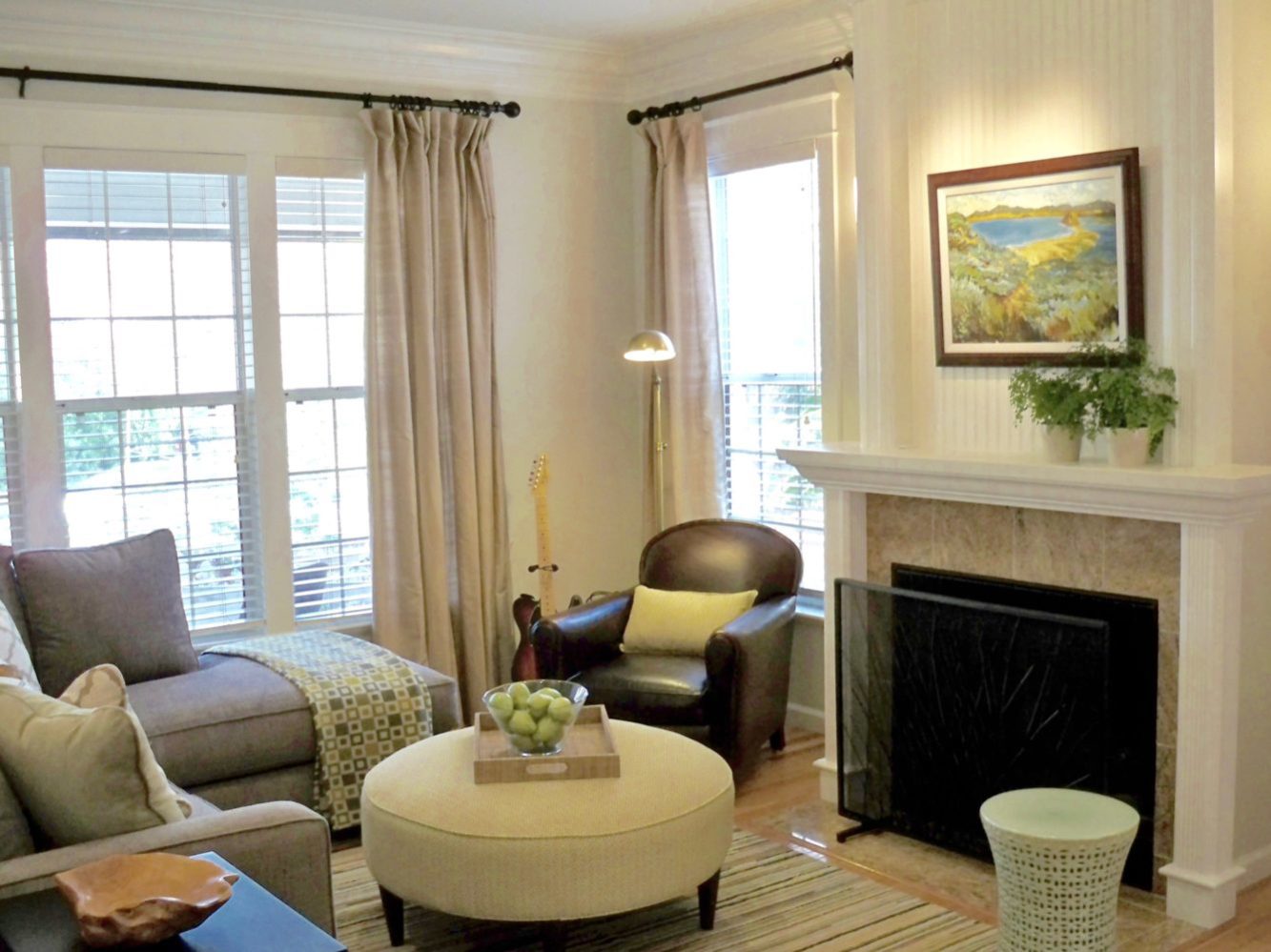
To produce the naturalistic ambience the clients wanted, I used a light, subtle green paint color on the walls. This was complemented by layered fabric schemes: a lattice patterned fabric for the dining chair cushions, a cigar-colored leather club chair, and Asian-inspired geometric pattern fabrics for the ottoman.
Nature was further brought in by using bird-patterned cushions, silk curtains, a 100% wool rug, Raffia trays, grand-father paintings with simulated bamboo frames, and a nature-inspired screen for the fire.
I added more strategic lighting using LED bulbs, and placed a large mirror on the dining area wall. The mirror not only reflects light, but gives an added dimension to the room.
Finally, I used different complementary metal finishes to create an eclectic feel: antique gold for the cabinet knobs and lighting fixtures, bronze for the window hardware, and champagne for ceiling mounts and lamps. As long as the pattern is consistent, the eye registers these slight variations as harmonious variations.
There it was: the modern Zen look they wanted to achieve, and every inch of space utilized for maximum comfort and efficiency. I’m happy to say they loved it!
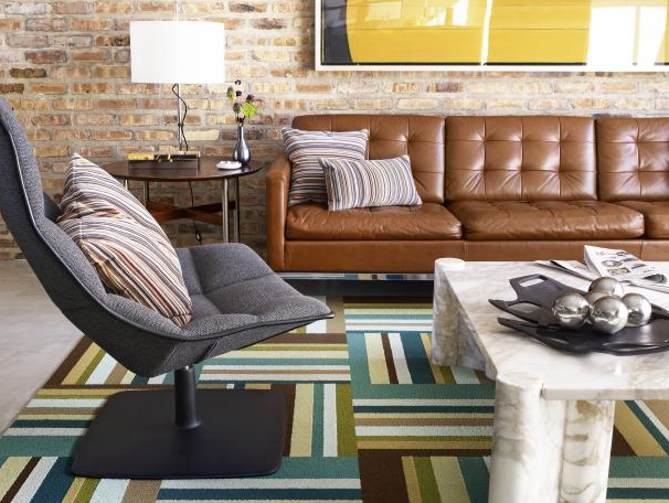
*Featured image credit: Flor
*All project Interior design photography by Yoko Oda Interior Design, LLC
